The room, as it stood, was a testament to good intentions and poor execution. Sarah stared at the bed, a lump of dissatisfaction forming in her throat. The duvet cover was a bold, geometric black and white, a purchase made during a decisive, “sophisticated” phase. The sheets beneath were a relic from a past life: faded, floral, and blush pink. They clashed. Not in a dramatic, intentional way, but in a sad, morning-after-a-yard-sale kind of way. The pillows were an assortment of whatever-clean-case-was-available. The room didn’t feel designed; it felt dressed in the dark. It was then, in that quiet moment of textile-induced despair, that Sarah made a decision. She wasn’t just going to buy a new bedding set. She was going to learn the language of linens. She was going to master the art of mixing and matching bed sheet colors and patterns.
This, she discovered, was not a science of rigid rules, but a story. A story told in threads per inch, in color harmonies, in the whispered conversations between a stripe and a paisley. It was a narrative of comfort and personality, and everyone, she learned, could be the author of their own nocturnal tale.
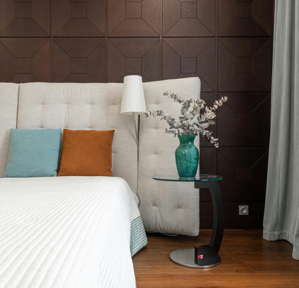
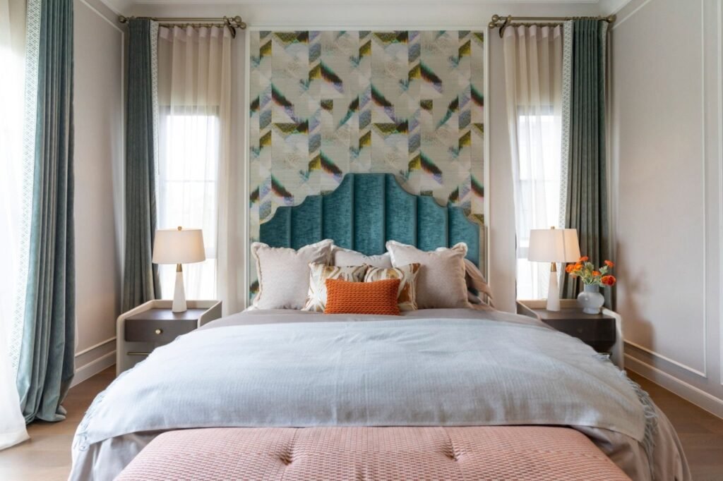
Our bed is the protagonist of our private space. It’s where stories end and begin—the final chapter of a weary day, the prologue to a hopeful morning. And like any good protagonist, it deserves a setting that reflects its complexity. A pre-packaged, matchy-matchy bedding set is like a character with only one line. Safe, predictable, but ultimately forgettable. Mixing and matching, however, allows for depth, for surprise, for a setting that is authentically you.

Sarah’s journey began not in a store, but in understanding the foundation: color. She learned to see her bedroom not as a blank canvas, but as a existing scene. The walls (a soft, weathered grey), the rug (a navy jute), the single piece of art above her dresser (an abstract with hints of terracotta and sage)—these were her supporting cast. The bedding needed to converse with them, not shout over them.
She remembered a tip from a long-ago art class: the 60-30-10 rule. In interior design, this often translates to 60% of the room being a dominant color (walls, large rug), 30% a secondary color (furniture, curtains), and 10% an accent. She applied this to her bed. The 60% would be her sheets and perhaps the duvet cover—the largest swath of textile. The 30% could be a secondary pattern or color in shams or a throw blanket at the foot of the bed. The 10% was for the sparkle: decorative pillows, a lumbar pillow, the piping on a sham.
But which colors? Sarah, timid at first, started with tonal storytelling. She chose sheets in a deep, oceanic navy (a nod to her rug) but in a luxurious sateen weave that caught the light. For the duvet cover, she went several shades lighter—a serene, misty blue-grey that echoed her walls. The result was immediate and calming. It wasn’t a “look,” it was a mood. It felt cohesive, layered, and deeply restful. She had written her first paragraph, and it was a peaceful one.
Encouraged, she wondered about introducing a character with more personality: pattern. This is where many stories go awry, she read. Patterns fighting for the lead, creating visual static instead of harmony. The key, she learned, was scale and relationship. A successful pattern mix is like a good ensemble cast—different, but working toward the same narrative goal.

She decided her solid navy sheets would be the reliable narrator. For the duvet cover, she chose a pattern, but carefully. A large-scale floral in navy and white? Too much of a leap. Instead, she found a duvet with a tight, small-scale grid pattern—a subtle graph paper effect in navy and cream. It introduced texture and rhythm without violence. On her next weekend adventure, she found the supporting actor: standard shams in a classic navy and white stripe. The stripes were bolder than the grid, but because they shared the same color family, they felt like part of the same story. A solid cream lumbar pillow became her 10% accent, a crisp pause in the dialogue.
Sarah was getting bolder. Her confidence grew with her vocabulary. She learned about color theory not as a dry chart, but as a way to set a tone. Analogous colors (those next to each other on the wheel, like blue, blue-green, and green) created serene, effortless chapters. Complementary colors (opposites, like terracotta and slate blue) created dynamic, energetic scenes full of tension and release. She thought of her friend Leo’s apartment, all warm woods and leather. He could tell a fantastic story with complementary colors: burnt orange sheets paired with a duvet in a deep teal, tied together with a throw blanket that contained both hues in a geometric pattern. It would be vibrant, inviting, and full of life—just like him.
The true test, the plot twist, came when she considered mixing patterns themselves. This was advanced storytelling, the domain of literary fiction. The universally accepted guideline was the rule of three: vary the scale. Pair a large-scale pattern (a big, blowsy floral) with a medium-scale pattern (a decent-sized stripe) and a small-scale pattern (a tiny dot or check). She saw it in a magazine: a bed with a large, abstract watercolor duvet, mid-scale striped shams, and small polka-dot sheets peeking out. It worked because the scales were distinct, giving the eye a place to rest and journey.
She also learned to use a “glue” element—a solid color that appeared in all the patterns, binding them together. A charcoal grey could be the background of a floral, the color of a stripe, and the solid of a sheet, making the whole ensemble feel intentional.
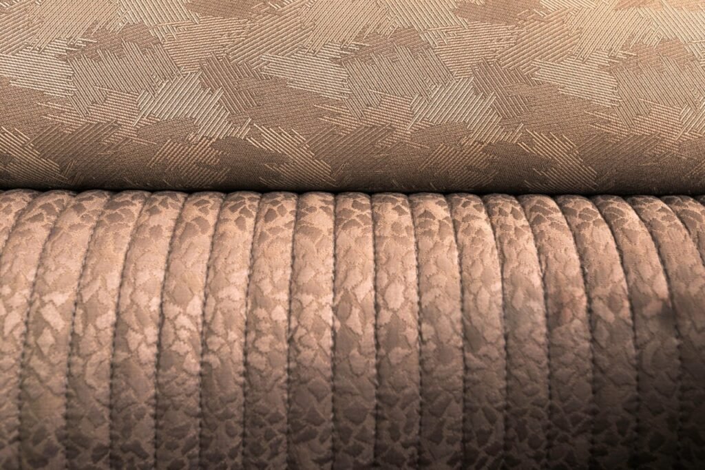
Texture, she discovered, was the silent narrator in this story. It spoke in subtext. A bed of all cotton percale, while crisp and lovely, could feel flat. Introducing texture was like adding descriptive prose. She folded a chunky, hand-knit oatmeal-colored throw across the foot of her navy bed. Instantly, it added warmth and tactility. A velvet pillow in a jewel tone against linen sheets created a rich contrast. She considered the whispers of linen, the cool sleekness of sateen, the nubby appeal of cotton canvas. Mixing textures within a monochromatic scheme became her favorite quiet tale: all white, but in linen sheets, a cable-knit throw, a matelassé coverlet, and a silk pillow. It was a symphony, not a single note.
As her expertise grew, Sarah began to see stories everywhere. The minimalist’s fable: pristine white sheets, a duvet in the faintest grey herringbone, two pillows in a charcoal grey linen. The story was one of space, breath, and calm. The bohemian epic: a base of rich, earthy terracotta sheets, a duvet piled with a vintage-inspired, large-scale floral in mustard and sage, topped with a mix of patterned and tasseled pillows, and a fringed Moroccan blanket. The story was one of travel, collection, and warmth.
The maximalist’s novel: where the “rules” were joyfully subverted. Clashing scales and colors used with deliberate, exuberant confidence. Pink leopard print sheets under a grand-millennial-style floral duvet, topped with gingham pillows and a tasseled trim. The story was one of personality, humor, and unapologetic joy.
Sarah’s own bed evolved. It became a seasonal narrative. In spring, she told a story of renewal with sage green sheets, a duvet cover embroidered with delicate white vines, and pillows in a soft, laundered lavender stripe. Summer’s tale was told in crisp navy and white stripes (like a sailor’s shirt) with pops of coral in a single throw pillow and the binding on a blanket. Autumn called for a chapter of richness: chocolate brown sheets, a duvet in a rusty orange paisley, and a velvet throw in deep amber. Winter was a silent, monochromatic poem in varying shades of grey and white, with texture as the only protagonist.
The day came when a friend visited Sarah’s apartment. She walked into the bedroom and stopped, not at the threshold, but a few steps in, her eyes taking in the bed. It was now a layered composition of a slate blue linen duvet, cream sheets with a nearly invisible tonal embroidery, shams in a navy and cream geometric print, and a single, sumptuous velvet pillow in a deep emerald green—a color plucked from the small painting on the far wall.
“This is… incredible,” her friend breathed. “It looks like it should be in a magazine, but it also looks like you. How did you… where did you even start?”
Sarah smiled, looking at the bed not as a problem solved, but as a story well-told. It was a story that had begun with a sigh of dissatisfaction and unfolded through lessons of color, scale, and texture. It was a story that changed with her moods and the seasons.
“It’s easy,” Sarah said, and she meant it. “You just have to listen. Listen to the room, listen to the colors you love, and then let them speak to each other. Start with a sentence—a sheet color you adore. Then add a paragraph—a duvet that complements it. Introduce a character with a pattern in a pillow. Let texture describe the setting. Don’t be afraid to edit. Sometimes the best line is the one you take away.”
She gestured to the bed. “This isn’t about decorating. It’s about storytelling. And your bed…” she concluded, “is the most personal story you’ll ever write. So make it a good one. Make it interesting. Make it yours. Start with a solid foundation, play with scale, don’t fear color, and let texture do the quiet work. The narrative of your dreams deserves nothing less.”
Her friend looked from the serene, layered bed to Sarah’s confident face, and then back again. She was no longer seeing just pillows and fabric. She was seeing the beginning of her own story, waiting to be written, one mix, one match, one dream at a time.