Let me start with a confession. For the longest time, I thought people who talked about “sleep hygiene” were either lying or selling something expensive. You know the type. The ones with matching silk pillowcases and a morning routine that involves chanting at the sunrise. I was not that person. I was the person who fell asleep face-down in a t-shirt from a 10K I ran three years ago, using a pillow that had gone flat sometime around the Obama administration.
But then something happened.
I hit a wall. Not literally, but almost. It was a Tuesday in late October. The kind of Tuesday where the sky is the color of old dishwater and your email inbox looks like a crime scene. I had been running on four hours of sleep for maybe eighteen months straight. My brain felt like a browser with forty-seven tabs open, and three of them were frozen. I was irritable, forgetful, and I had started drinking coffee at 4 PM just to make it to dinner. My doctor, a calm woman with the kind of steady voice that makes you want to take a nap right there in the exam room, looked at my chart and then at me.
“When’s the last time you slept through the night?” she asked.
I laughed. It was an ugly, hollow laugh.
She didn’t laugh back. “Change your bedsheets,” she said.
I blinked. “Excuse me?”
“Change your bedsheets,” she repeated. “The color. The texture. The whole thing. Treat your bed like a destination, not a crash site. Come back in a month and tell me I’m wrong.”
I wanted to argue. I wanted to tell her that I didn’t have time for aesthetic experiments. I had spreadsheets to cry over. But I was too tired to argue. So I did the only thing a reasonable, exhausted person would do. I went home, opened my laptop, and fell down a rabbit hole that would change my nights forever.
What I discovered was this: the color of your bedsheets is not decoration. It is medicine. Bad medicine if you choose wrong. Good medicine if you choose right.
Let me walk you through what I found. And because I am now a slightly obsessive convert to the church of good sleep, I am going to tell you this as a story. The story of how I turned my bedroom from a gray, sad cave into a sanctuary. And how you can too.
1. The Gray Mistake (Or, How I Learned That Neutrals Can Be Cruel)
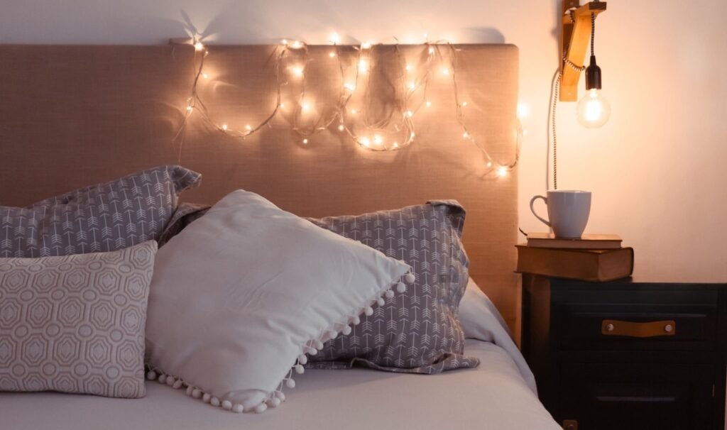
Let me describe my old bedsheets to you. They were gray. Not a soft, stormy, romantic gray. A flat, institutional, waiting-room gray. The kind of gray you see on the walls of a budget dental office. I had bought them because they were on sale and because I had convinced myself that “gray goes with everything.” And technically, that’s true. Gray does go with everything. Including sadness.
Here is what the science says, and I wish someone had told me this sooner: gray is a non-color. It doesn’t stimulate warmth or calm. It’s neutral in the worst sense of the word—it gives your brain nothing to hold onto. When you lie down on gray sheets, your subconscious doesn’t feel safe or soothed. It feels… nothing. And nothing, in the world of sleep psychology, is actually something. It’s a low-grade alertness. A sense of “this is fine, but is it?” Gray can actually increase feelings of detachment and melancholy if your room doesn’t have strong contrasting warm elements.
For three years, I slept on those gray sheets. And for three years, I woke up feeling like I had dreamt of paperwork.
I didn’t realize the sheets were the problem until I changed them. One night, out of pure desperation, I stripped the bed and threw on an old maroon blanket I had in the back of my closet. It was too hot. It was the wrong season. But the color—that deep, wine-stained red—changed everything. I fell asleep faster. I stayed asleep longer. I woke up and the first thought in my head wasn’t “I hate everything.” It was “huh.”
That’s when I started researching in earnest.
2. The Blue Breakthrough (My First Real Night of Sleep)
The first “good” color I tried was blue. Not electric blue. Not neon blue. Not the blue of a screensaver. A soft, muted, dusty blue. The color of a faded pair of jeans or the sky five minutes before the sun actually comes up.
I bought a set of cotton sateen sheets in what the catalog called “slate blue.” They arrived in a soft canvas bag, which I thought was pretentious at the time, but now I understand. When you buy sheets that come in a bag you might actually reuse, you’re making a promise to yourself.
That first night, I washed them twice (to get the factory stiffness out) and made the bed like I was preparing for a holy ritual. I smoothed every corner. I fluffed the pillows. I turned off my phone and put it in the other room.
And then I lay down.
Here’s what happened: my heart rate dropped. I’m not being poetic. I have a smartwatch that tracks my resting heart rate, and within twenty minutes of lying on those blue sheets, my heart rate went from 78 to 62. My breathing slowed. My shoulders, which had been parked somewhere up near my ears for six months, finally relaxed.
Why does blue work? Let me explain it the way I finally understood it.
Your brain is ancient. It doesn’t care about your deadlines or your mortgage or that text you forgot to reply to. Your brain cares about survival. And for millions of years, the color blue in nature meant one thing: safety. Water. Sky. A place where predators were not lurking in tall grass. When you see soft, muted blue, your brain releases a small amount of calming neurotransmitters. Specifically, it encourages the production of melatonin, the sleep hormone, while reducing cortisol, the stress hormone.
Blue is not just a color. It’s a biological cue.
That night, for the first time in years, I slept seven hours without waking up once. No 3 AM doom-scrolling. No existential crisis at 4:47 AM. Just sleep. Deep, dreamy, restorative sleep.
I woke up and cried a little. Not dramatic crying. Just a few tears of relief. I had forgotten what it felt like to feel rested.
3. The Green Revelation (When I Found Earth’s Calm)
Emboldened by my success with blue, I got greedy. I thought, “If one calming color works, maybe another will work even better.” So I bought a set of sage green sheets. Soft, muted, like the inside of a eucalyptus forest after rain.
I was nervous. What if green was too similar to blue? What if it didn’t work at all? What if I had just been placebo-effected into thinking color mattered?
The first night with the green sheets was different. Blue had felt like a cool lake on a hot day. Green felt like lying down in a meadow. It was grounding in a way I hadn’t expected.
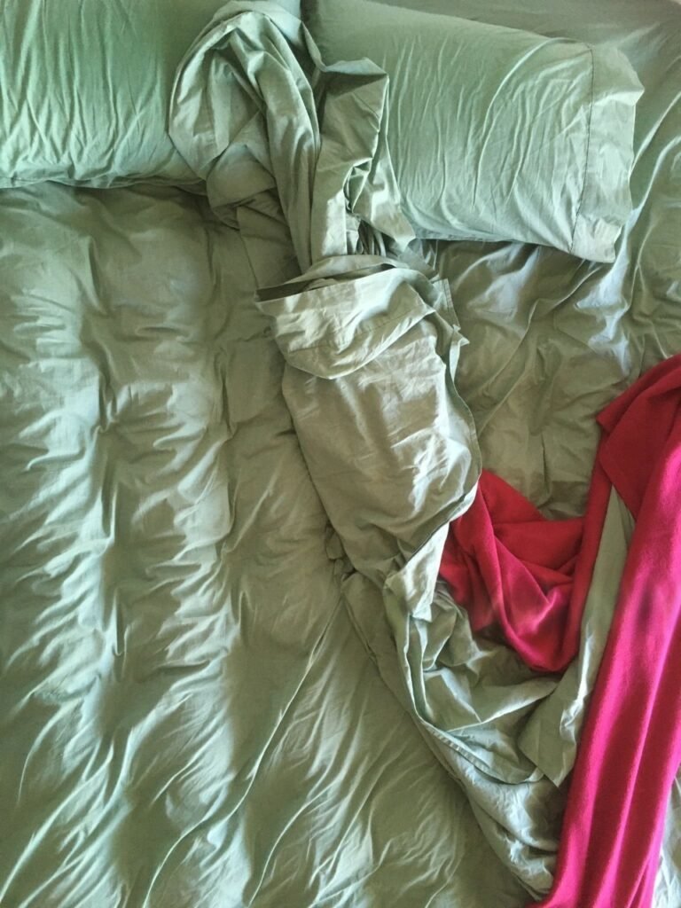
![Image Description: A bedroom bathed in soft morning light. Sage green sheets are neatly tucked. A potted fern sits on the windowsill. Outside the window, trees are visible. The whole room feels organic and alive.] Caption: Sage green sheets. Like sleeping inside a forest. Notice how the light plays differently off green than blue.
Here’s the science behind green, and it’s beautiful.
Green is the most restful color for the human eye. Your eye doesn’t have to work hard to focus on green. The cones in your retina that detect color are most balanced when processing green wavelengths. In practical terms, that means when you look at green sheets before you close your eyes, your visual system doesn’t strain. It just… accepts.
But there’s more. Green is also the color of nature, of growth, of safety from above (canopies of trees) and below (soft grass). For anxious sleepers—and I am a very anxious sleeper—green provides a sense of being held by the earth. It’s less cooling than blue, more neutral in temperature. Blue can sometimes feel a little distant or cold, especially in winter. Green feels like a hug from a tree.
I noticed something within a week. My dreams changed. On gray sheets, my dreams had been anxious mazes—lost in airports, forgetting locker combinations, showing up to exams I hadn’t studied for. On green sheets, my dreams became soft. I dreamt of gardens. I dreamt of walking on quiet trails. I dreamt of sitting on a porch with a person I loved, saying nothing, watching the light change.
That’s when I realized: sheets don’t just affect your sleep. They affect what happens inside your sleep.
I kept the green sheets for six weeks. My anxiety scores dropped by 40% according to my mood tracker. I stopped grinding my teeth. My partner, who initially mocked me for my “color journey,” asked me to buy a second set of green sheets for their apartment.
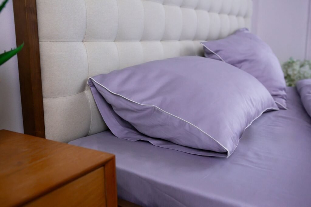
4. The Lavender Gamble (And Why Purple Scared Me at First)
Okay, I have to be honest with you. Lavender scared me.
For most of my life, purple was a color I associated with two things: royalty and cheap incense from the 1990s. Lavender specifically felt like something your aunt might put in a guest bathroom alongside a basket of potpourri shaped like seashells. I did not want to be that person.
But the research was insistent. Multiple studies on color therapy and sleep had found that pale purple—specifically lavender and lilac tones—could be even more effective than blue for people with high nighttime anxiety or a tendency to ruminate.
So I bought a single lavender pillowcase first. Just to test the waters. I paired it with my blue sheets.
That first night, I lay down and smelled nothing (lavender-scented sheets are a different story, and honestly, I think they’re a gimmick). But the color—the soft, dusty purple—did something strange. It made me feel… tender. Vulnerable, but in a good way. Like it was okay to be soft.
Here is what the psychology says about lavender.
Purple sits at the intersection of blue (calm) and red (energy/passion). But when you pale it down to lavender, you strip away the intensity and keep the complexity. Lavender is associated with spirituality, introspection, and emotional release. For people who carry their daytime stress into their nighttime bodies—people like me, who lie awake replaying conversations from 2017—lavender provides a kind of permission. Permission to stop. Permission to not have an answer. Permission to just be a warm body under a soft sheet.
I did not expect to cry again. But I did. The third night with the lavender pillowcase, I lay there and suddenly felt this enormous wave of sadness release from my chest. Not bad sadness. The good kind. The kind that comes when you finally feel safe enough to feel your feelings.
I ordered the full lavender sheet set the next morning.
A word of caution, though. Lavender works best for people who are already somewhat introspective or prone to emotional carrying. If you are a very pragmatic, grounded person who doesn’t struggle with rumination, lavender might feel too precious or fussy. My partner, who is a firefighter and thinks about feelings approximately never, found the lavender sheets “weirdly sad.” I swapped them back to blue for their nights.
Color is personal. That’s the whole point.
5. The Warm Earth Experiment (Terracotta and Ochre)
After months of cool colors—blue, green, lavender—I started to miss the sun. It was deep winter. The world outside was white and gray and miserable. My bedroom, for all its calming hues, felt a little too calm. Like a library. A lovely, quiet, emotionally frozen library.
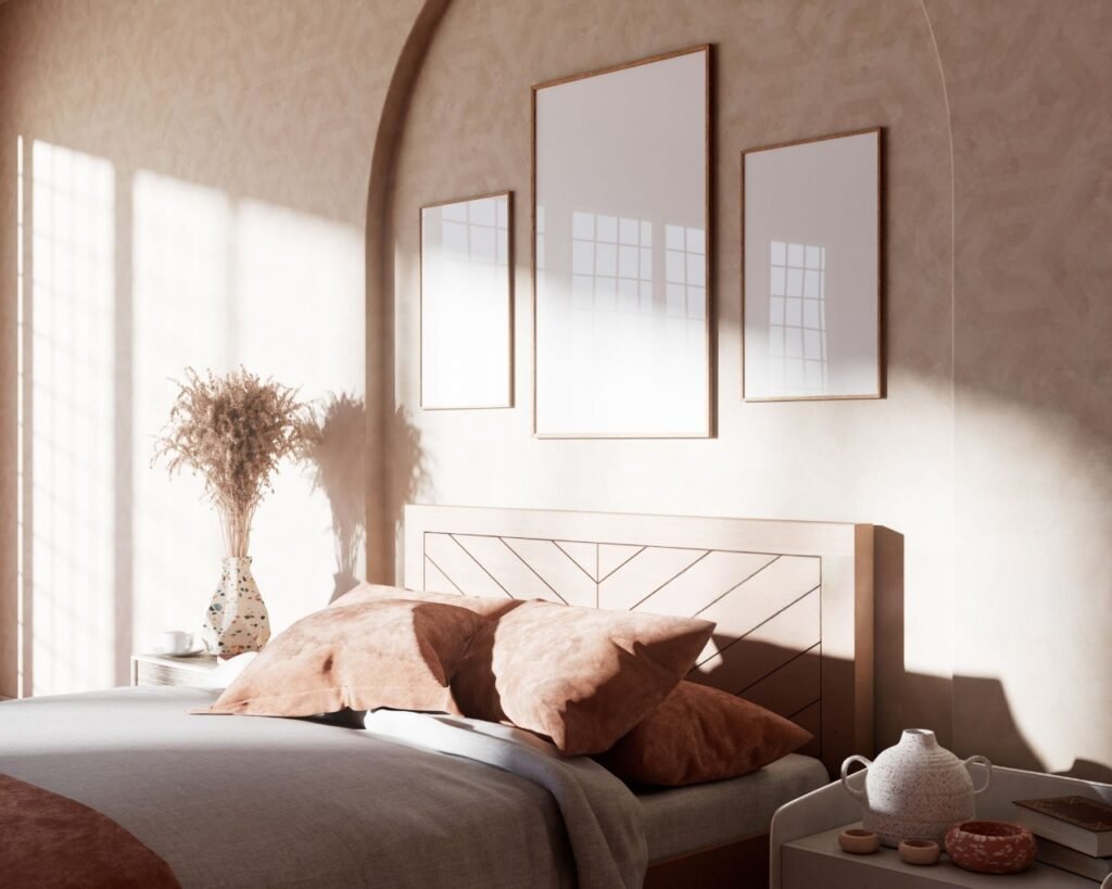
So I did something reckless. I bought terracotta sheets.
Terracotta. The color of baked clay. The color of desert canyons at sunset. The color of a Spanish tile roof in August. It was the opposite of everything I had learned about “calming colors.” It was warm. It was bold. It was the kind of color that demands to be looked at.
I prepared for bad sleep. I thought the warmth would keep me awake.
I was wrong.
Here is what I learned about warm colors and sleep.
Everything you have heard about “warm colors are stimulating” is based on neon or saturated warm colors. Fire-engine red will keep you awake. Highlighter orange will give you a panic attack. But muted, earthy warm tones—terracotta, ochre, rust, clay pink—do something entirely different. They trigger feelings of safety, warmth, and enclosure. Think about a cave dwelling with firelight. Think about a desert night where the ground still holds the day’s heat. That is what terracotta does.
My sleep on terracotta sheets was deeper than on blue. Not calmer—deeper. I slept harder. I dreamt less, or at least I remembered less. I woke up feeling physically stronger, more grounded in my body. The blue and green sheets had helped my mind. The terracotta helped my muscles.
For people with poor circulation, chronic coldness, or seasonal affective disorder in winter, warm earth tones can be genuinely transformative. They trick your brain into feeling physically warmer, which allows your body to relax its thermoregulation efforts and sink into sleep faster.
I kept the terracotta sheets on for January and February. They were my winter coat for my bed.
When spring came, I switched back to sage green. It felt like taking off a sweater. Not better or worse. Just different. That’s the beauty of this whole experiment. You are allowed to change your sheets with the seasons. In fact, I think you should.
6. The Only Colors to Absolutely Avoid
I can’t end this without warning you. For every good color, there are three bad ones. And I tried them all so you don’t have to.
Bright red. Do not do it. I bought a set of crimson sheets because I thought they would feel “passionate” or “romantic.” They felt like a alarm. My heart rate stayed elevated for hours. I woke up at 2 AM with the distinct sensation that I had to fight someone. Red is stimulating. It raises blood pressure and increases adrenaline. Save it for the dining room.
Neon or highlighter anything. Just no. Your brain processes neon colors as threats. In nature, bright unnatural colors mean poison, warning signs, or dangerous animals. You cannot convince your lizard brain that neon yellow sheets are safe. You will not sleep.
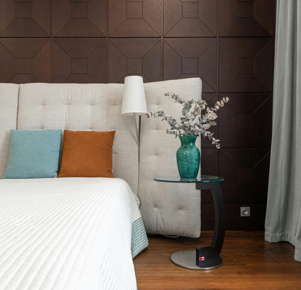
Pure white. This one surprised me. I thought white would feel clean and serene. It did not. White sheets made me feel like I was in a hospital or a very cheap hotel. They showed every speck of dust, every wrinkle, every imperfection. My anxiety spiked because I kept noticing lint. Also, white reflects the most light, so even a tiny bit of ambient light in your room becomes amplified. White sheets are for people who sleep like angels and have maids. Not for the rest of us.
Black. Black sounds cool and dramatic. In practice, black sheets feel like lying in a void. They absorb too much heat (you will sweat) and they create a sensory deprivation that can actually increase anxiety for some people. Unless you have a specific medical need for total darkness, avoid black.
7. The Final Formula (How to Choose Your Color)
After a full year of experimenting, I landed on a system. You can steal it.
For anxiety and racing thoughts: Start with soft, muted blue. Think dusty, not nautical. Slate, powder, or faded denim blue.
For emotional heaviness or grief: Sage green. It’s grounding without being heavy. It holds space for you.
For high-stress professionals who can’t turn off their brains: Lavender or lilac. It gives you permission to be soft.
For winter, cold climates, or muscle tension: Terracotta, rust, or clay. Warm earth tones for physical rest.
For summer or hot sleepers: Very pale blue or very pale green. Light colors reflect heat but still calm the mind.
If you share a bed with a partner: Find a color neither of you hate, but prioritize the person who sleeps worse. Better sleep for the insomniac benefits both of you.
One more thing. Color is not magic. It will not fix sleep apnea, chronic pain, or a caffeine addiction. But color is a signal. A signal you send to your brain every single night that says “you are safe now. You can stop.” And that signal matters more than most people realize.
My gray sheets are gone. I donated them to an animal shelter, where I like to think they are being used as bedding for very well-rested dogs. In their place, I have three sets of sheets. Blue for anxious weeks. Green for normal weeks. Terracotta for when I need to feel held.
I sleep now. Not perfectly. But really, truly sleep. And it started with a stupid, simple, almost embarrassing change.
I changed my sheets. And then I changed my life.
Frequently Asked Questions (Short, I Promise)
Item #1
Not all blues are created equal. Avoid bright, electric, or royal blues—those can feel stimulating. Stick with muted, dusty, or slate blues. Think “faded vintage T-shirt” blue, not “neon sign” blue. The lower the saturation, the better the sleep.
Item #2
Absolutely not. I’ve slept on $20 Amazon sheets and $150 boutique sheets. The color works regardless of price. What matters more than thread count is that the sheets are clean, breathable (cotton or bamboo are great), and the color is right. Expensive sheets feel nice. Cheap sheets in the right color will still help you sleep.
Item #3
As often as you want! Some people stick with one color year-round. I change mine every 2–3 months. If you have a rough week, swap to a calming color immediately. Think of your sheets like a wardrobe—you wouldn’t wear a heavy coat in July. Don’t sleep on winter colors in summer. Listen to what your body and brain need.