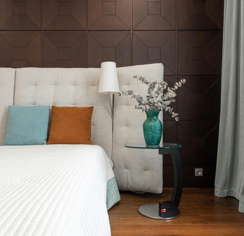
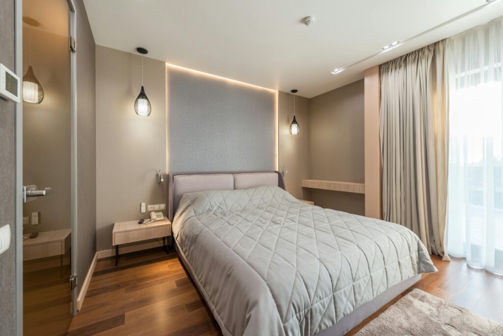
There is a quiet, almost imperceptible shift that occurs when you step out of a sterile, fluorescent-lit corridor and into a room wrapped in soft sage, sun-baked clay, and weathered stone. Your shoulders drop a fraction of an inch. Your jaw unlocks. Your breathing, previously shallow and hurried, slows into a steady, rhythmic cadence. You haven’t actively made a decision to relax; your body has made it for you.
For decades, modern design treated color primarily as a matter of aesthetics, trend cycles, or personal preference. We debated whether grey was “out” or whether beige was “boring,” treating pigments as mere superficial coats applied to the canvas of our lives. But neuroscience and evolutionary psychology tell a vastly different story. The human eye does not merely register color as light wavelengths on a spectrum; it decodes it as environmental intelligence.
When your eyes encounter the muted, powdery hue of sage green or the rich, iron-laden warmth of terracotta clay, you are not just looking at paint on drywall. You are participating in an ancient visual conversation that began hundreds of thousands of years ago on the African savanna. To understand why these earthy tones exert such a profound, soothing hold over our modern nervous systems, we have to travel back to the primal landscape where our visual hardware was forged—and discover why our brains are hardwired to recognize earth tones not as simple decoration, but as the ultimate sanctuary of safety.
The Landscape of Survival: Decoding the Primal Spectrum
To grasp why the human mind reacts so placidly to organic palettes, we must first look at the environment in which our ancestors evolved. For roughly 99 percent of human history, our survival depended entirely on our ability to accurately read the subtle shifts in the natural world. Long before the invention of written language, concrete cities, or digital displays, the natural environment was our primary text, and color was its most urgent print.
In the wild, bright, hyper-saturated colors are rarely invitations to rest. High-contrast, vivid hues in nature almost always carry a warning. A sudden flash of electric yellow or harsh scarlet often signifies venom, poison, or an apex predator hiding in the brush. Extreme contrast demands vigilance; it triggers an immediate spike in cortisol and adrenaline, priming the central nervous system for fight or flight. High saturation was a visual alarm bell.
Conversely, muted earth tones were the steady background ambient hum of security. A horizon dominated by soft greens, warm ochres, deep browns, and clay red was an environment rich in resources and low in acute threat.
Consider sage green. In a ancestral landscape, the presence of muted, grey-green vegetation indicated steady water sources, fertile foraging grounds, and a climate mild enough to sustain plant life without burning it to crisp ash. Unlike the stark, neon green of toxic algae or the harsh yellow of scorched drought, sage green represents mature, stable vegetation. It signals that food is growing, shelter is near, and water is accessible. When light reflected from a sage-covered field hit the ancient human retina, the amygdala—the brain’s emotional alarm center—registered a critical piece of news: We can stay here. We will not starve today.
Terracotta and clay hues echo natural shelter, hearth fires, and mineral-rich earth.. Source: Vecteezy
Clay, Ochre, and the Architecture of Home
If sage represents the nourishment of the living landscape, clay and terracotta represent its shelter. The connection between human psychology and red-brown clay runs deeper than architecture; it is woven into our very biology and cultural genesis.
Terracotta, derived from the Italian for “baked earth,” is the color of the ground beneath our feet when it is rich in mineral iron. For early hominids, clay was the first true material of creation and safety. It was the mud used to seal crude stone shelters against freezing winds, the material shaped into the earliest water vessels, and the pigment pulverized into red ochre to paint the walls of deep, protective caves.
When we look at clay, our subconscious registers the warmth of the hearth and the stability of solid ground. Unlike cool, synthetic greys or clinical stark whites—colors virtually nonexistent in nature outside of snowstorms and bare granite cliffs—clay hues project a tactile, grounding warmth. Red ochre is, in fact, one of the oldest pigments ever used by human hands, dating back over 100,000 years in archeological sites such as Blombos Cave in South Africa. Our ancestors did not choose ochre and clay by accident; they painted their sanctuaries with the very colors of the earth that cradled them.
When light reflects off a clay-toned wall into a contemporary room, it mimics the long-wavelength light of late afternoon—the golden hour. In evolutionary terms, late afternoon signaled the end of the hunt, the gathering around the fire, and the safety of the group camp. It was the time of day when vigilance could finally be lowered and rest could begin. Clay and terracotta carry this dusk-like quality in their visual DNA, telling the modern brain that the hard work of the day is done, and it is safe to drop your guard.

Biophilia and the Neurological Parasympathetic Shift
Modern urban environments present an sensory landscape that our ancestral brains are ill-equipped to process. We are constantly surrounded by sharp geometric angles, high-frequency electric lighting, synthetic neon signs, and glowing blue screens. This sensory bombardment creates a subtle, chronic state of neurological hyper-arousal known as “techno-stress.”
Neuroscientists studying environmental psychology have found that when people are exposed to biophilic elements—design choices that reintroduce natural textures, organic geometry, and earth-derived colors—their physiology undergoes a measurable shift. The sympathetic nervous system, responsible for the stress response, dials down its activity, while the parasympathetic nervous system, responsible for rest, digestion, and cellular repair, takes over.
This visual phenomenon is closely tied to how our eyes process natural light wavelengths. Earthy tones like sage, moss, clay, sand, and slate sit in a specific spectral frequency range that requires minimal ocular accommodation. In simple terms, your eye muscles do not have to strain to process these shades. They lack the glaring intensity of bright primary colors and the stark light absorption of jet black.
When you enter a room painted in sage and accented with warm clay ceramics, your visual cortex processes the scene with remarkable neurological ease—a concept known in cognitive science as high “processing fluency.” The brain interprets this lack of perceptual strain as peace. Because the visual environment is easy to process and free of high-contrast visual threats, the brain infers that the surrounding environment is inherently safe.
Designing the Inner Sanctuary: Earth Tones in Modern Life
As our lives become increasingly digital and abstracted from the physical world, our living spaces must work harder to ground us. The overwhelming resurgence of earthy palettes in interior design over recent years is not merely a passing decorative trend; it is a collective emotional reaction to an overstimulated world. We are intuitively rebuilding the ancestral caves our ancestors knew, filling our homes with materials and colors that shield us from the relentless pace of modern life.
Integrating these colors into your own environment isn’t about covering every surface in brown and green; it’s about creating a harmonious visual ecosystem that balances warmth and tranquility.
Sage green works exceptionally well in spaces dedicated to rest, focus, or quiet conversation, such as bedrooms, home offices, and reading nooks. Because green sits directly in the center of the visible light spectrum, it is the most restful color for the human lens to perceive. Paired with natural timber, woven linen, and soft indirect lighting, sage transforms a room into a serene leafy canopy.
Clay, terracotta, and soft ochre, on the other hand, bring vitality and communal warmth. They are ideal for spaces where people gather—kitchens, dining rooms, and living areas. These rich, earth-born colors ground a space, providing a feeling of physical weight and permanence in a world that often feels intangible and fleeting.
When combined, sage and clay create a balanced visual ecosystem: the cool, restorative breath of living foliage paired with the grounding, enduring strength of the warm earth. Together, they form a complete sensory narrative—one that echoes the meadows, riverbanks, and sheltered hillsides that sheltered humanity for millennia.
Frequently Asked Questions
Why do bright synthetic colors make us feel anxious compared to earth tones?
Bright, highly saturated synthetic colors rare in natural landscapes often trigger a mild alarm response in the brain. Evolutionarily, vivid hues in nature signaled danger, toxicity, or predatory threats, raising visual vigilance and cortisol levels. In contrast, earth tones require low cognitive processing effort, signalling a safe, non-threatening environment.
Can earth tones like sage and clay really improve mental focus and sleep?
Yes. Exposure to muted, natural colors lowers heart rate and sympathetic nervous system activity, promoting a parasympathetic state. Sage green reduces visual strain in workspaces, aiding sustained focus, while warm clay and terracotta tones in bedrooms evoke late-afternoon natural light, encouraging the production of melatonin for rest.
How can I introduce earthy tones into a modern apartment without major renovation?
You do not need to repaint every wall to benefit from earth tones. Introducing biophilic elements through terracotta pottery, sage-colored linen textiles, unrefined wooden accents, clay wall art, and indoor living plants creates the same neurological sense of grounding and safety without requiring permanent structural changes.